Ta-ran-ta-RA!


A few months ago, I started work on a new collection named “ta-ran-ta-RA” based on elements of the circus and tricksy performing animal characters. This theme appeals to me on a personal level as I love anything to do with circuses, funfairs, piers, pavilions and so on. Perhaps it comes from many a weekend traipsing the pebbly beaches and soaking up the atmosphere of Brighton Pier as a child but I don’t think that I’ll ever get sick of the sight of a big wheel, a stripy tent, or a merry-go-round!

I started off by creating some of the characters, who then got worked up into repeating patterns. The characters then ended up taking centre stage and I’d love to develop some further illustrations around them. I imagine this collection adorning a child’s playroom or bedroom one day, so I tested out the patterns on a few mock-ups and enjoyed the results.

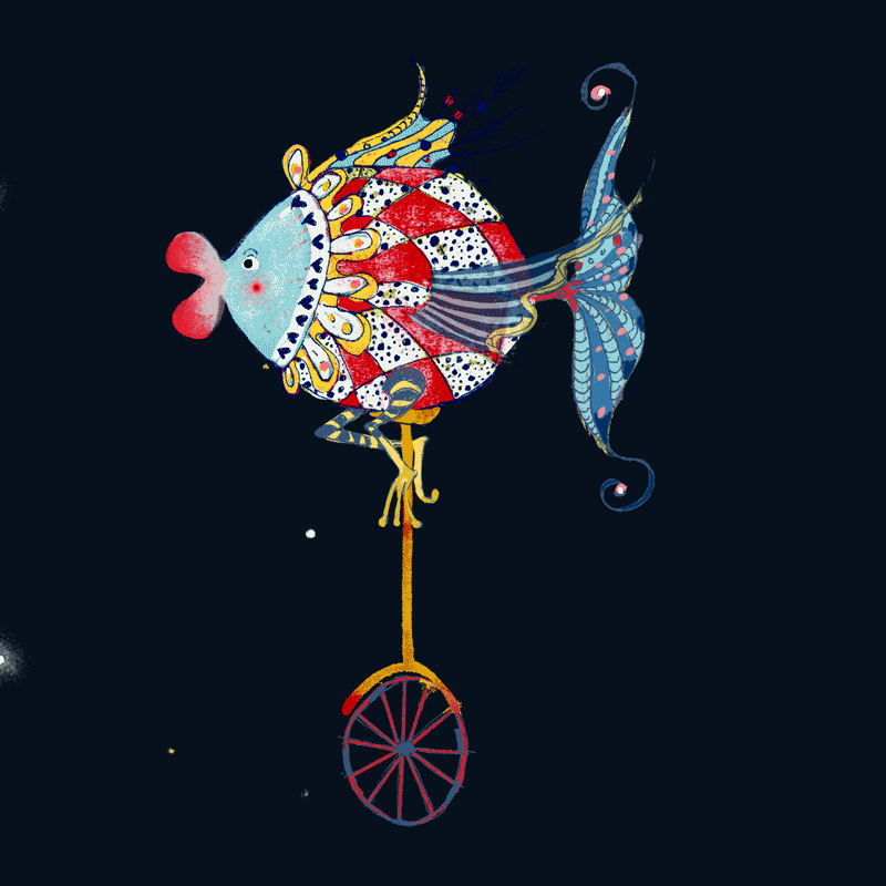
Let me introduce you to two of my characters:

“Harlequish”, the harlequin unicycling fish who loves to pedal through the night sky all the way up to the stars. She’s a fearless fish with a love of adventure.

“Harlequish”, the harlequin unicycling fish who loves to pedal through the night sky all the way up to the stars. She’s a fearless fish with a love of adventure.

‘Harlequish’ made into a suggested repeat pattern

‘Harlequish’ made into a suggested repeat pattern

After some thought I decided I couldn’t just describe ‘Harlequish’ as cycling through the night sky, I wanted to actually see her do it! It took some time and a bit of self-teaching with the timeline tool in Photoshop, but I got there! I would love to make more animations of my illustrations in this way and bring them all to life.

Harlequish-animation.gif
This is ‘Juggle-phant’ and that’s right, he just loves to juggle! When the stars come out and night falls you’ll find him under the light of the moon humming happily to himself whilst throwing his juggling balls (or if he can’t find them, maybe an a…

This is ‘Juggle-phant’ and that’s right, he just loves to juggle! When the stars come out and night falls you’ll find him under the light of the moon humming happily to himself whilst throwing his juggling balls (or if he can’t find them, maybe an apple or an orange) up in the air!

Here are all the characters worked into a pattern. Below you can see some suggestions for how they could work decoratively in a child’s playroom.

Here are all the characters worked into a pattern. Below you can see some suggestions for how they could work decoratively in a child’s playroom.

Mock-Up-Room-Chair-and-Pic.jpg
Mock-up-Kid's-Room.jpg
 

A Celestial Silver Lining

‘Celestial Playground’ is the most recent design I worked on, and there is a bit of a story behind it.

This design was an entry for the ‘Make it in Design’ Winter School (Check out all of their incredible courses here) which I was half-way through when suddenly the bottom fell out of my world as my mother became critically ill. Within a matter of hours I left Australia and went to her bedside in France. She passed away shortly after I got there.

I had packed my sketch book with me, thinking that it would be a good distraction to keep working on the design school briefs, anticipating that I would be spending a lot of time at night, possibly by myself, mulling over things and falling down the rabbit hole. In the dark couple of days after her death, I worked away on my sketches and ideas for the intermediate track, called ‘Cosmos' - Celestial’, which seemed a very apt theme to allow me to escape into my imagination.

My ideas started forming around the imagery and concepts from a personal favourite tale, ‘The Little Prince’, which tells of the frustration of a little boy who doesn’t understand why grown ups cannot see things in the way he does. I focused on a little boy character who was playing in a celestial environment, planting stars, catching stars, gazing at stars. It all felt right. Perhaps it was unknowingly a little homage to my beautiful mum and her vivid artist’s imagination and childlike way of interpreting the world at times.

Working the sketches into the pattern happened quite organically, and the MIID school provided a beautiful colour palette involving some rich mustardy yellows, dusky pinks and deep indigo blues. I inverted the idea of a typical space palette by making my planet forms dark and the surrounding atmosphere a light, playful pink tone.

The final design, ‘Celestial Playground’

The final design, ‘Celestial Playground’

After completing that brief I was unable to continue with the Winter School due to the bereavement. I plan to go back and complete the last couple of briefs in my own time.

A few weeks later, It was with first astonishment, and then delight, that I clicked on a link from the Make it in Design facebook page, seeing one of my designs featured in the link. Curious to know why my design was on there, I followed the website link and discovered that my design had been given first place in the Winter School’s intermediate category, selected out of a lot of other incredibly talented designers’ work, by the wonderful Fashion Formula judges. I will now be able to see the design come to life printed on 3 square metres of a fabric of my choice, as well seeing it made into gift wrap.

Thank you so much to the wonderful Make it in Design school for this wonderful acknowledgement, and for all the opportunities that you offer to so many aspiring surface pattern designers.

I am pleased that at least my mum got to see the preliminary sketches for this design. This one is most certainly dedicated to her.

This mock-up template was provided by the Make it in Design team for the Winter School participants. It really helped to visualise the design in situ

This mock-up template was provided by the Make it in Design team for the Winter School participants. It really helped to visualise the design in situ

Taking the Leap

It’s funny how often people used to say to me, “your art work is quite ‘deep’ isn’t it?” or “do you always work in monochrome?”, perhaps hoping for a glimpse of colour. 

Fleeting Memories of a Seascape (Lithograph, 2004)

Fleeting Memories of a Seascape (Lithograph, 2004)

The one review I ever got from a Sydney Morning Herald critic even described my art work as “post-apocalyptic”. I suppose that’s where the art work detaches from the artist and becomes the ownership of the viewer - laid bare for interpretation. 

It’s interesting though, that all those years I drew in charcoal or created etchings and lithographs in black ink, I relished the world of monochrome, enjoying the theatricality and drama it provoked, despite working with fairly innocuous subject matter: retrieving scraps of memory, symbols of childhood or recreating fading coastal scenes.

Curiosity Gathering (Charcoal Drawing 2012)

Curiosity Gathering (Charcoal Drawing 2012)

Ironically, colour arrived around 5 years ago in 2013, when I started facing my own ‘darker’ subject matter. Fighting health scares, and in the aftermath of intrusive surgery, my drawings were suddenly flooded with colours, bright ‘happy’ colours. To my surprise, an array of tones from blues to pinks, oranges and yellows now permeated the pages. I suppose the colour was some kind of therapy after the stark hospital environment. Kind folks said, “How pretty!” or “I love the colours!”, all the while ignoring the drawn lines and darker symbols of surgical instruments and human organs within the works.

I laughed at the irony .. that drawings addressing my deepest fears were disguised as “pretty” … and that perhaps, rather subversively, I saw ‘trauma’ in colour.

With a contrary nod to Dorothy stepping out of her sparse black and white Kansas reality into the technicoloured yet insecure world of fantastical Oz, I stepped out of my faded imaginary world of memories into a brightly coloured physical reality.

Surgical Procedures (Watercolour 2013)

Surgical Procedures (Watercolour 2013)

Fast forward to 2018 and that colour still exists in my work, but the work itself has transformed into a new reality. Nowadays the colour palettes are perhaps more muted (with the occasional bright 'pop').

The subject matter is still insistent on nostalgic seaside imagery (that good old West Pier!) but has diversified into all sorts of other areas too. I've packed the charcoal away (for now), since being a mother with limited time and space (and tiny creeping fingers always at the ready to snatch things) has meant I have had to change my working method in order to keep going. Enter laptop and drawing tablet stage left! Thanks to a chance encounter with an old art school friend at the park last year, I discovered the world (rather, the infinite universe) of surface pattern design. And after taking a brave leap and enrolling into an online course to learn everything I could about 'digitalising' my art work, here I am. And so begins a new chapter.

There is definitely a side of me that still craves the messy, inky fingers, the smell of etching ink, the alchemy of printmaking, and the spontaneous and vigorous process of producing a huge charcoal drawing. That side is just calmly and patiently resting until one day I will have the space and time to get more physical with my art again. For now, however, I am quite happy in my little digital world of illustrating and pattern making.

Please check in with me along the way. I'd love to take you on this 'walk along the pier' too!

A Walk along the Pier (Illustration refined through Adobe Photoshop 2018)

A Walk along the Pier (Illustration refined through Adobe Photoshop 2018)